Monday, January 25, 2010

Wolf Kahn Trees


LEARNING TARGETS:
-Recognize a landscape.
-Experience masking.
-Experience wet-on-wet watercolor technique.

TERMS:
-Wolf Kahn: A living artist that paints primarily landscape paintings.
-Landscape: An image of outside.
-Masking: Blocking off a portion of the paper/canvas and painting over it to leave the area the original color.
-Wet-on-wet: Applying wet paint to wet paper by applying water to the paper first.

MATERIALS:
12" X 18" Watercolor paper
Rolls of painter's tape for each table
Scissors
Watercolor paints
Paint brushes
Water containers/Water
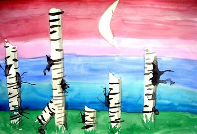

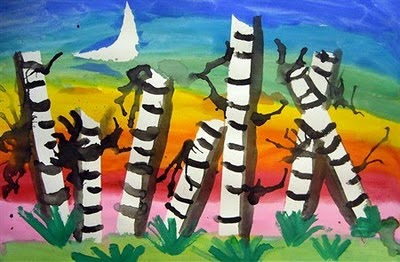
After talking about Landscapes and Wolf Kahn, viewing a slideshow of each we started the project. Students were asked to first put down at least 5 strips of painter's tape, near the bottom of the page. Next, they put pieces of tape together by overlapping them to create a larger piece of adhesive and cut out a moon. When all pieces needed are masked off, the painting begins! Start with the ground, because when the sky is added it will draw the water upwards, making the horizon line look like grass/bushes. I encouraged my students to use not only green, but also yellow and brown in the ground. When the ground is complete, cover the rest of the paper with plain water. Add stripes of color, which should blend into each other on the wet paper. If the paint is not blending, there is not enough water. Students can even lift the paper in different directions to make the paint run.
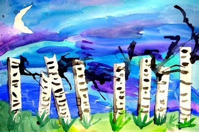

When the sky is dry, the teacher should remove the masked areas to reveal the white paper beneath. Next class, students should be taught additional watercolor techniques to complete the details of the painting. First, they should add the clumps of grass, pressing the brush down at the base of the grass, and lifting it as the blade gets higher. This will cause the brushstroke to get thinner. Next, we talked about the moon being a light source and that a shadow is the absence of light. The kids reasoned that if a shadow is the absence of light, it should be on the side of the tree opposite the moon! I showed them how to use a lot of water and a little bit of black paint to create a gray shadow. TROUBLESHOOTING: if the shadow is too dark, add more water and spread the paint out. If it is already spread out, add more water and dab with a paper towel. Curved black lines should be added along the trees; some longer than others. Finally, the last step is to add a watery dab of paint to the side of a tree and use a straw to blow the paint to look like branches.
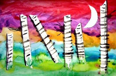

ASSESSMENT: While the kids are painting the sky, be sure to circulate the room making sure students are comprehending the wet-on-wet technique. Many will need to be encouraged to use more water and some will forget to use it at all! Completed works of art should be assessed for completion of all steps and craftsmanship.

Twisted Trees

LEARNING TARGETS:
-Students will understand the difference between two-dimensional and three-dimensional works of art.
-Discuss the differences between spring, summer, fall, and winter trees.

TERMS:
-Three Dimensional: The object has three dimensions, or characteristics; Height, Width, and Depth.
-Form: A three dimensional work of art.

Materials:
Small paper bag
Scissors
Mat board or cardboard base
Glue
OPTIONAL:
Colored/white tissue paper to represent leaves/snow
Glitter


After introducing the Element of Design: FORM and discussing how trees look different in different seasons, I have the kids cut five lines in their paper bag (bigger bags can support more lines; I predraw the lines for them). Next, they should open the bag. Some kids need help getting it open without ripping it. Once it is open, they should squish the whole bag and twist to create a trunk. Next, twist each individual cut piece at the top. I stress twisting tight, and twisting all the way to the end of the paper.

When all pieces of the tree are twisted, the bag should be glued to the cardboard base. NOTE, it is easier to have them write their name on the cardboard before they glue the bag to it. Details can be added, such as tissue paper for leaves/snow and glitter for the shimmering of a fresh snowfall.


ASSESSMENT: Completed works of art are assessed for completion; I check that there are enough details to make it look done, that all the pieces of paper are fully twisted, etc. and craftsmanship.

Thiebaud Gumball Machines


LEARNING TARGETS:
-Understand that printmaking can produce multiple copies of an image.
-Know that Thiebaud painted desserts, such as gumball machines.

TERMS:
-Printmaking: Using a plate (in this case, a stamp) to create images, often multiple images.
-Wayne Thiebaud: A Pop Artist most famous for his paintings of desserts.

MATERIALS:
8 1/2" X 11" white paper with a circle pretraced by the teacher (ice cream lid works perfectly)
Circle stamps (I bought wooden circles and small spindles at Jo-Ann and glued them together to make stamps with handles)
Paint in red, orange, yellow, green, blue, and purple.
8 1/2" X 11" red paper
4" X 6" grey paper
Scissors
Glue/ Glue sticks
Paintbrushes
Pencils


We once again began with a PowerPoint, this time highlighting paintings by Wayne Thiebaud; focusing on his gumball machines. Next, demonstrated how to stamp the circles. I asked them to start with yellow and work their way to the darker colors. We talked about how the darker colors change the color of a lighter color and we don't want to have funny colored gumballs. In hindsight, I think I would just have a stamp and paintbrush for each color to eliminate the cleaning the stamp between each color (I had them wipe them with a papertowel). I also asked them to stamp 1-3 circles outside of the pencil circle for the gumballs that have been purchased in the final picture.


Next class, I passed out the paintings first and while they were cutting those out I passed out the red paper, gray paper, and glue. I showed them how to fold the red paper the "hot dog" way and make the red base of the machine by drawing a small horizontal line and then a long diagonal line to the top of the page. I also showed them how to trace the top of the circle (with it flipped over, in case they get pencil on it) to make the lid, and use the corner of the paper to make a rectangle. I showed them all the pieces, and layed it out how they should glue it down and then gave them time to work.


ASSESSMENT: In addition to circulating the classroom, looking for success and redirecting misguided students I review the completed works of art for use of all the colors in the gumballs, cutting and gluing skills, and craftsmanship.

Friday, January 22, 2010

CALL FOR LOCAL ARTISTS!

My school will be having an annual art show/silent auction in APRIL. Start creating, and plan to submit some art to out great show! It is led by a parent/artist with the silent auction in the Media Center, a student art exhibit in the atruim, and live music by our talented students. Come check out the festivities! More info to come as it is available.

Sunday, January 17, 2010

Thank You

On Friday I had a fourth grader come into my room before school. He handed me a potholder and told me he wanted to give it to me. I thanked him, and he explained that "I want to give you this because you taught me how to weave and if you hadn't, I wouldn't have understood the instructions. So this is just my thank you to you." Honestly, this is why I teach. To have a student recognize the connection between what we created in class and something happening in his personal life and use his knowledge. I admit, when he left I was a little choked up. What a great way to start the day!

Tuesday, December 29, 2009

Matisse's Goldfish

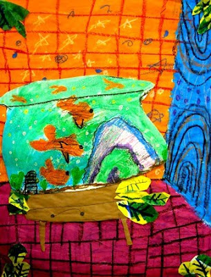
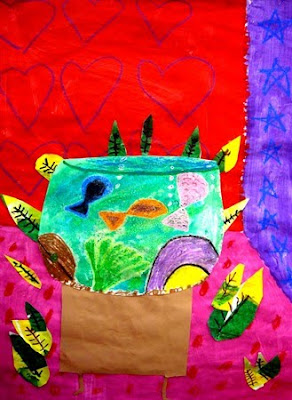
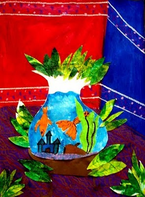
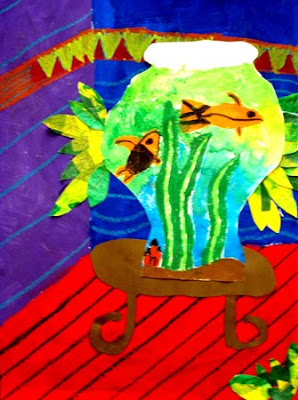
My second graders did an outstanding job on their Matisse project, so I decided to share it.

LEARNING TARGETS:
~Know who Henri Matisse is, and that he had a big impact on the art world.
~Recognize the use of outlines.
~Know what collage is
~Create a successful work of art using Matisse as inspiration.

TERMS:
Henri Matisse:An artist that started as a painter, using bold colors, outlines, and patterns. Known for founding "fauvism" and inventing collage.
Collage: The art of cutting shapes out of paper and gluing them together to create a work of art.
Outline: A line around the contour of an image.

Goldfish by Henri Matisse


We began with a PowerPoint of Matisse's life and work. We started with his paintings, and noticed his use of bright color, bold pattern, and outlines. The PowerPoint then lead into his invention of collage and finished off with a more detailed discussion of his painting Goldfish. My observant students noticed all of the above aspects of the painting, and also the reflections of the fish, and use of a unique "bowl" for the fish.


We then used a ruler and three lines to create a 3D room for our fish bowl. Students found the 6" mark on their ruler and put it on the edge of the paper, about a third of the way up on the right hand side and drew a diagonal line from the 6" to the end of the ruler. Next, they created a horizontal line from the end of the diagonal line to the end of the paper. Finally, a vertical line was added from the point where the first two met to the top of the page. Instant room! Then next class, students painted each wall a color, and the floor a third color. Finally, when the paint was dry they used oil pastels to add patterns on the walls and lines on the floor. I show them how to use parallel lines to create tile, brick, or hard wood floors.


The next step is to create an imaginative bowl for the fish. I remind the kids that Matisse's bowl was unusual and theirs can be traditional or unique. I demonstrate how to add oil pastel to the fish and details in the bowl and watercolor over it. Some even added salt to create a texture that represents bubbles! I am currently teaching this lesson at one of my schools, and we also discovered that it's fun to use a broken pencil to scratch details such as scales into the oil pastels! They look stellar!


Finally, students created paper for the leaves by painting a 50/50 glue/water mixture over tissue paper in shades of green and yellow onto a piece of white paper. When dry, they drew leaves on the back and cut them out. The whole work of art was collaged together to create the final work of art. The finishing touch was to use green, black, or brown (or all three!) markers to add veins in the leaves.


ASSESSMENT: Because this is such an involved project, it takes a long time and makes talking with the kids about it easier. Students are focused on the same learning targets for a number of weeks, and during class discussions, 99% of hands are raised with the answers to questions about Matisse and his work. I also look at the final projects for craftsmanship, creativity, and attention to detail. These always turn out amazing, and I have gotten a lot of positive feedback from parents, other teachers, and people on Artsonia.com.

Saturday, December 26, 2009

The Dot

I have found that first graders are very conscious of the craftsmanship of their art. Many get hard on themselves for not being able to do a project as "good" as my samples, to which I remind them that I have been practicing much longer than they have and if they keep practicing they will keep improving. To help them gain confidence at the beginning of the year, I start with this pointillism project. It's great because it teaches them to try new things, art history (George Seurat), and a new art technique (pointillism).

LEARNING TARGETS:
~Use dots to create a successful work of art.
~Understand that artists use dots to create an image (pointillism).

MATERIALS:
10" X 10" white tissue paper
12" X 12" colored paper
Markers
Newspaper
Sponges and water
Glue (for mounting finished pieces)
TERMS:
Pointillism: Technique of using dots to create an image.
Symmetry/Symmetrical: The same on both sides; a mirror image.


We start by reading The Dot by Peter Reynolds, about a girl that didn't think she was good at art. Her art teacher told her to "make a dot and see where it takes you." By the end of the book, she has her own art show! We talk about the importance of trying new things and practicing-I stress that "practice makes better"- not necessarily perfect.


Next, I show the students my examples and tell them that it's not as hard as it looks and if they pay attention to the instructions, they will have a wonderful work of art. Next, I demonstrate the project. First, they fold a 10" X 10" piece of white tissue paper in half twice to create a smaller square. Using a sponge with the tissue on top of a piece of newspaper they should get the tissue wet, so they can see through it but not have a puddle on it.


Finally, they use markers and only dots to create a pattern on the smaller square. I stress that if they want a line they have to make the line with dots, not by drawing a line. I demonstrate how to make shapes with dots instead of drawing them. Lastly, they bring their papers up to me to open them up. I lay them on the newspaper with the artist's name on it until it is dry and then mount them on 12" X 12" colored paper.


ASSESSMENT: In addition to circulating the classroom, watching for comprehension and guiding students to find success, I assess the completed works of art for the use of dots, craftsmanship, and creativity. When assessing for the use of dots, remember that the water can sometimes blend the dots together; especially if the student didn't finish in one class period and had to re-wet the project the following class.

Sunday, December 6, 2009

Op Art

My fifth graders finally finished their first project! I was amazed that they were still working on it, since they started before I left for my maternity leave. Apparently, they had several classes canceled due to assemblies and field trips, etc. Next year we will use smaller paper so it doesn't take as long!

LEARNING TARGETS:
~Students will understand Op Art
~Students will understand the introduced terms
~Students will create a work of art with value and depth

TERMS:
Op Art: Optical Illusion Art. Art that tricks the eye.
Vanishing Point: The spot where everything disappears.
Value: The lightness or darkness of a color.


We started by dissecting the term Optical Illusion Art and looking at examples of Optical Illusions. The terms were introduced, and then there was a demonstration. They were asked to trace three circles anywhere on the page. I then asked them to make a dot near the center of the paper and use a ruler to make lines coming out from the dot. They had to make an even number of triangles for the project to work. They were shown how to add curved lines in each triangle to create the illusion. After working on that, I showed them that they should color the smaller stripes with a black Sharpie.


Once the lines were colored, I showed them how to do the circles. I asked them to do half a circle at a time. Their lines should start and end at the middle of the outside of the circle, and curve towards the outside of the circle, creating an "eye" on the circle. They then do the same thing, crossing the first and color it in a checkerboard pattern.


Once all the black is colored, we reviewed Value and I showed them how to create not just darks and lights, but many middle values. I stressed that the middle values are what really will make their drawings "pop." Both the triangles and circles should have dark values on the outside of the shape and get lighter as they move to the center. They took forever, but turned out amazing!

Tuesday, November 24, 2009

Laurel Burch Cats

This is one of my favorite third grade lesson plans. Students learn so much from this project, and the final pieces are always stunning. We begin with a PowerPoint about Laurel Burch's life and artwork. We discuss her style, and I always lead the conversation to make sure students notice blended colors in the background of the figures/animals, bold patterns, and the one line she uses to create the animals' eyes and nose. The kids are so engaged and love Burch's bold style.

FIRST CLASS PERIOD
Next, we use a guided drawing technique to create our unique cats. I walk them through the drawing one step at at time, and give them options along the way to ensure that no two cats look alike. Before we start, I draw several large rectangles on the board and tell the kids that those are my papers and if I draw something large on my paper, theirs should also be large. Their goal is to have a cat that takes up the whole page when they are finished. Begin the drawing with the cat's head-instruct the students to draw a large U-it should take up about half of the paper. Next, connect the top of the U with a line that starts diagonal, flattens to horizontal and then is diagonal again to create the ears and top of the cat's head. To start the cat's face, instruct students to watch all the types of noses they can make before they decide which one to use. Draw two vertical lines in the middle of the cat's head and show them three types of noses; square, triangular, and rounded at the bottom. Once the nose is drawn, they should add curved lines from the top of the nose to the sides of the cat's face. These are the top of his eyes. The bottoms of the eyes can be large or small, depending on where the kids place the lower lids; show several choices. They should add a circle inside the eyes, and can add a dot or line inside the circle.
Next is the cat's body. First show them examples of cats with and without wings and tell them if they choose to add wings, they should make a skinnier cat to leave room for them. If not, the cat's body can go all the way to the edge of the paper. I instruct them to start with the front paws, which can be on the left or right of the cat. I show them both choices, and instruct them to make a "lower case d and lower case b," to help them see the shape of the paws. Next is the back of the cat's body, which I draw with several choices of tails. I show them a curved tail, a straight tail, and a wavy tail and tell them they can use one of those or make up their own tail. They look nice if the tail touches the front paws, but if they don't they need to add a belly to the cat between the paws.
Finally students can add some personal touches. They can add a mouth, tongue, whiskers, freckles, lines for toes, wings, and/or a halo. Next, they need to go over every pencil line with black crayon very darkly. I show them how to color over the same spot several times to cover all of the color of the paper.
SECOND CLASS PERIOD
Next class, we finish the crayon if necessary and start the color. We used chalk pastels for the blended color background. This time, I asked them to use warm/cool colors-either one color group for the whole cat, or one for the head and the other for the body. I liked them much better using these color groups! I demonstrate how to clean off the chalks and blend them with their finger. I discourage using a tissue for blending as I feel the tissue takes some of the color off and makes the paper rough. Once their chalk is done, I ask them to run an eraser along their crayon lines to get the excess chalk off and brighten the color and to erase any smudges outside of the cat.
THIRD CLASS PERIOD
Our final class period focuses on the patterns of Burch's animals. I remind them of the types of patterns that Burch used to avoid getting any crazy patterns or stripes. The students are shown oil pastels, and I point out the differences between the chalk they used last time and the oils they will use this time. They are instructed to add the patterns and finish up the cat's eyes. I encourage them to use more than one color in the eye, as it makes it much more interesting. I have laminated these in the past, but be aware that if you do the oil pastels will melt. Rarely, they melt too much and smear across the project.
ASSESSMENT
I assess the completed works of art for: blended color, use of pattern, correct use of warm/cool colors, and craftsmanship.