UPDATE: I totally forgot a really important feature-it's password protected!
Here is the first in a series about using an iPad in the Art Studio effectively. I discovered this app a couple of weeks ago, and am completely in love with it! How did I get along without it all these years?! It is a bit spendy at $7.99, but I think it is completely worth it. I have been told that "Planboard" is similar and free, but I tried that first and as an elementary teacher, my school wasn't listed. I requested it to be added and never heard back from them. Upon trying again a week later, my school still wasn't listed. I couldn't even try it without my school being listed so I gave up and found iDoceo.
What does iDoceo do? It is a schedule, calendar, planner, gradebook, and seating charts all in one app. You can also upload resources and lesson plans, but I haven't gotten that far yet. I have my students' photos all added into my program, so I created a fake class to show you how to get started.
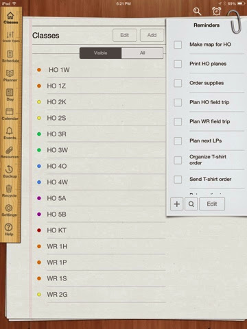 |
| This is my main page. All of my classes are listed, and there is a to-do list on the right. On the left are the links to other aspects of the app. |
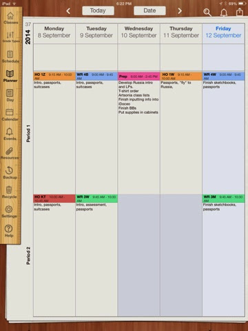 |
| Here is my planner. I color coded my classes by grade level for easy reference. I love being able to copy/paste my lesson in and then just add details to remember exactly where the class left off! It also allows for week and day views. |
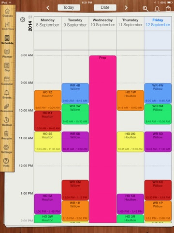 |
| This is the ONLY program I have found that allows me to use our six day cycle for the schedule/planner. It actually allows the user to create a cycle of any amount of days! |
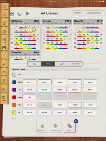 |
| To create a cycle, put the classes in first. Then go to the calendar tab to get this screen. Click on "cycle" then "Automatic Copy." Tap the days in the cycle-for me it was Day 1-Day 6-then type "Automatic Cycle" again and you'll see the calendar repeat. I color coded the days for easy reference to the cycle day as well. |
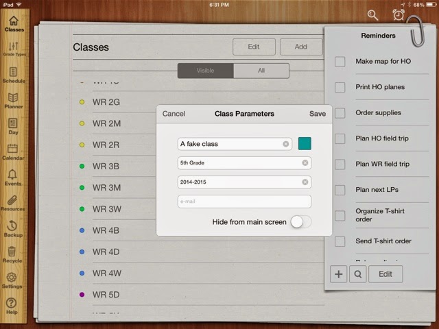 |
| Creating a class is simple-just tap "Add" and put in the info about the class. This is where I color coded them by grade. |
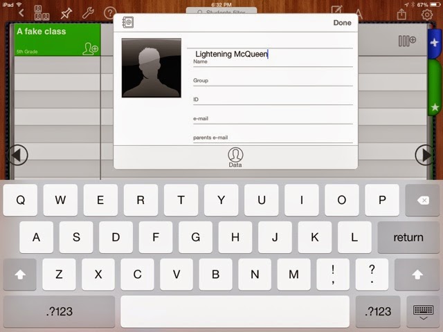 |
| Once in your new class, tap the silhouette with a + by it to add a student. You can put in their parents, emails, address, phone numbers, etc but don't have to. A photo can be uploaded or taken in the app-I walked around and took individual pictures of my students. It took less than ten minutes during class time while they were working on their project. |
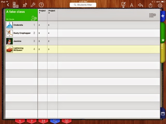 |
| The three vertical lines with a + by them in the top right corner allows users to add columns for projects. The app also allows for custom grading formats and adds grades! |
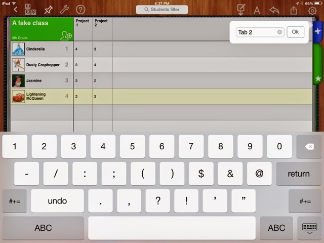 |
| On the right you can see a green tab and a blue tab. The blue tab adds more tabs and lets the user name them. I have a tab for each trimester and one for my SLO data-all in one place, and I can upload it to any app I have that uses the cloud-such as Google Drive, Dropbox, etc. |
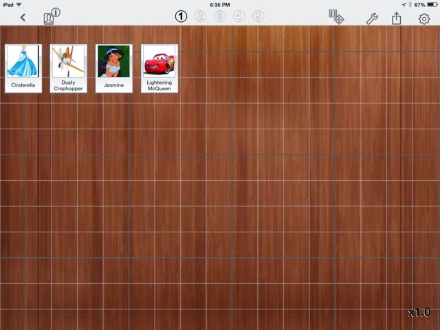 |
| Each class can have up to five seating charts-complete with the student photos. Just click on the three silhouettes on the top left to get to them. I wanted to signify what table each child sits at, so I used Sketchbook Xpress to create an image with colored squares on it to use as the background image. |
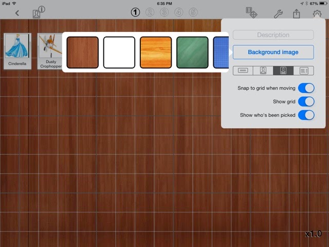 |
| Here is how to change the background image in seating charts. I had the image in my camera roll. |
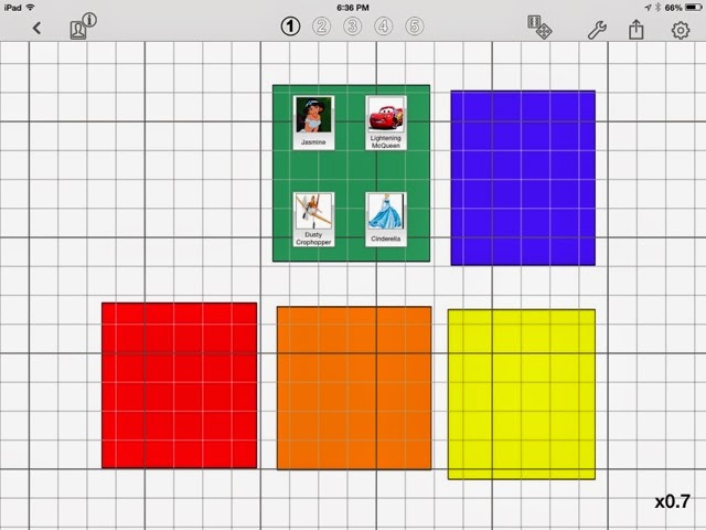 |
| This is what my seating charts look like! Super easy for subs to use. I uploaded them to Dropbox and printed them to put in my sub binder. |
iDoceo does not need an internet connection to work-which is another thing I love about it as one of my schools has very spotty WiFi. I love it, so I wanted to share how amazing it has been for my organization so far this year.


No comments:
Post a Comment